Personality Crisis- Rusty O'Shacklewell
FAWW gallery presents ‘The Nut Seller of Islington’ A solo exhibition by graphic designer Personality Crisis Opening 17th October 6-8pm until 17th November
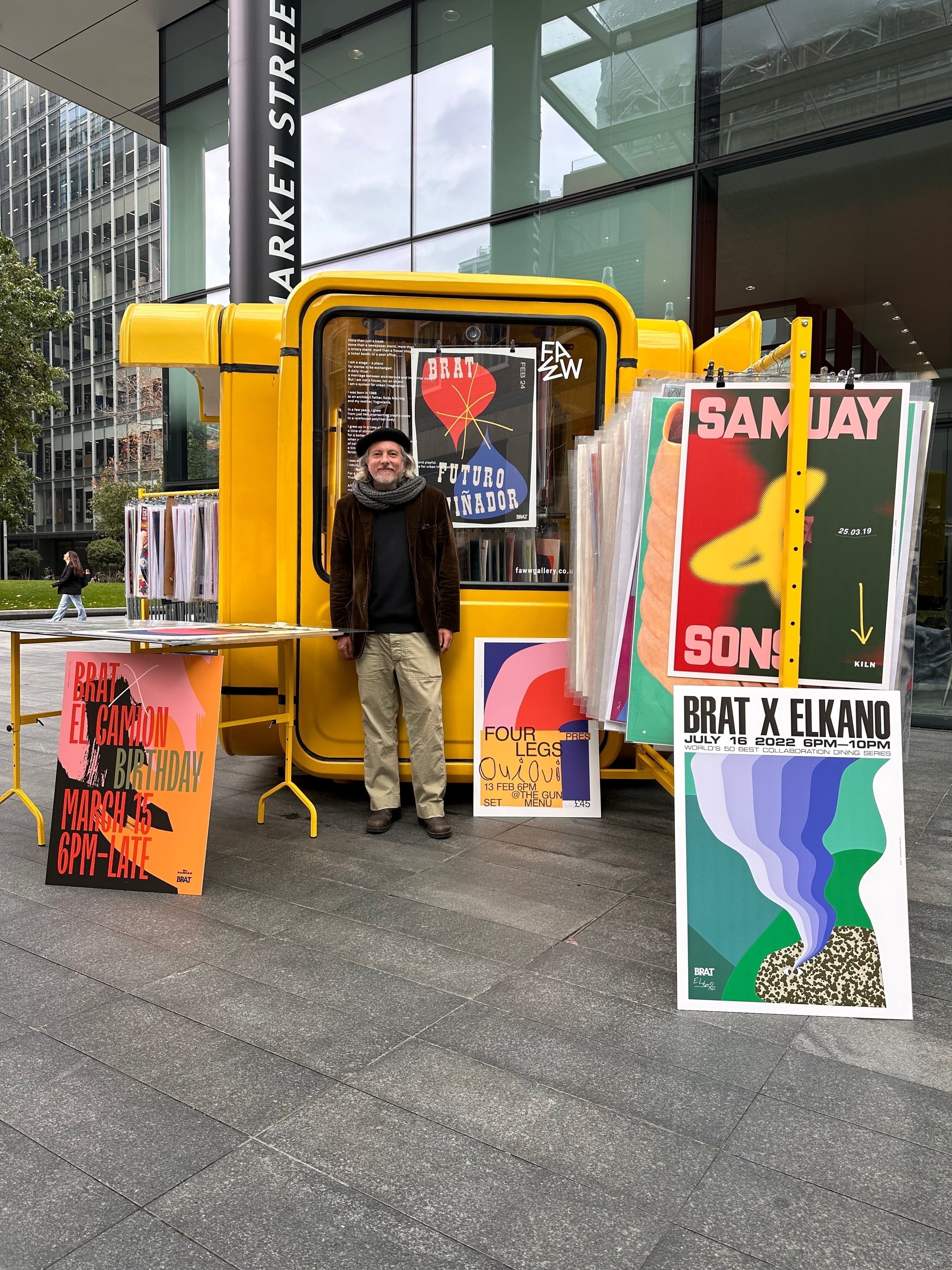
FAWW gallery is pleased to announce an Autumn exhibition, featuring a selection of bold and colourful prints by graphic designer Rusty O’Shacklewell. Each print on display has been designed by O’Shacklewell to mark an event on the London food and gig scenes. From announcing a night of live performances at the Shacklewell Arms to spotlighting a wine night at Kiln in Soho, the posters celebrate both the vibrancy of evenings out in our capital city and the natural intersection of music and food which colours London’s nightlife. Through stylish typography and psychedelic splashes of colour, these posters produce a synaesthetic effect, evoking the flavours and sounds on offer through visual cues.
In these posters, is a celebration of the edge and innovation unfolding in London’s bar, restaurant and music culture, along with a glimpse into the increasing presence of graphic design capturing the meeting of food and music across the city.
Whether it’s the colours, the typography, or the shapes, is there an element you start with when designing each poster...is there a chronology to your compositions?
I always start with a bit of research, and make some notes... what the event is about... where the subject matter is from, or inspired by... then that gets me thinking about a style, form / narrative, which often informs the colour palette. Typography wise, I often use condensed fonts for titles, as for me they work great on posters, then details in a complimentary font. I see posters as a notice, to make people stop and look... then tell them some information... a visual honeytrap!
Your colour combinations are particularly striking, how do you decide on the colour palette for each poster?
Thank you! Often it’s what I’ve seen recently or has inspired me... surroundings too... I was in Marrakech in January at the Jardin Majorelle... those colours ended up on a poster I was working on there. Morocco / India are and continue to be very inspirational. I love using colours / shades that are not obviously complimentary. Travel really informs me... and rugs, old eastern europe record sleeves from the early 70s... Polish / Czech film and theatre posters... and Dr. Who’s (Tom Baker era) scarf! Recently I was talking to someone about how I often use seasonal colours in posters, bright in summer, and love the shades of autumn... they just seem to seep into the consciousness. I suppose though, it’s what the poster is about / I’m trying to allude to... I did one for the chef Ixta Belfrage X Brat Climpson’s Arch last summer.
Tropicália - a creative movement that originated in the late 1960s in Brazil - informed the colour palette and style for that one, as Ixta has Brazilian heritage.
With your posters on show in Spitalfields, can you tell us about your personal connection to the place and what it means to you?
I am very proud to have my posters on show in Spitalfields! I used to come to Spitalfields when I was a boy with my uncle buying veg for the family market stall in Islington when Spitalfields was a wholesale fruit and veg market. That was back in the 80s! My grandfather also bought from there after they moved Covent Garden wholesale market out to Nine Elms in the mid 70s. I lived in Hong Kong in the mid 90s and when I returned in 1996, moved to Shoreditch and rented a room in a flat in Cheshire Street off Brick Lane, and would frequent the Golden Heart pub opposite.
How would you characterise your style?
Abstract-narrative. Playful. I like to build my posters with hidden meanings and references that are not immediately obvious.
What inspires you artistically?
Very much travel, music, early 70’s record sleeves, book covers and Polish / Czech poster artists... the RA Abstract Expressionist exhibition was a game changer for me. People I work with and for are inspiring. Designers like the late great Barney Bubbles and Jamie Reid... Tadanori Yokoo... Atelier Populaire Mai ‘68 posters. And there’s beauty in the streets... sometimes I walk round the city and find strange markings on the pavements, paint marks or signs. If you look, you see so much.
Graphic design is increasingly becoming a feature in promoting events in bars and restaurants- why do you think this is?
The food / wine scene is so vibrant and exciting and I have been very lucky to work with visionaries like Super 8 restaurants. Ben Chapman, a good friend and the creative director / partner of Super 8 said to me he wanted to promote chefs and events like gigs so that’s what we did! Sharing a love of obscure Japanese psychedelic music and references certainly helped! Tegan Ella Hendel, who did all the typography posters for P. Franco / Peg in Clapton... so beautiful and eye-catching. It’s a very creative scene, they care about the visual aspect as much as the interiors, their produce and fare... they’re passionate about what they do and great people to work with.
